3D visualization is hard to do well. Does VR fix it? Nobody is ready to answer that question. Let’s go deep to get started.
High-dimensional data visualization is an art form. Shape, color, size, and motion are all beautifully exploited. Depth, on the other hand, is rarely used.
In a static scene, humans rely on a number of depth cues to fully understand 3D spatial relationships, including:1
- Perspective: the changes in size and angle of objects based on their distance
- Occlusion: the blocked visibility of a far object with a nearer object in front of it
- Stereopsis: the inference of depth from the two offset viewpoints of your eyes
- Convergence: the relative angle of your eyes as they focus on an object at a certain distance
- Motion parallax: the relative motion of two stationary objects when the observation point moves
There are a few important things to note about precision based on this list:
- Occlusion is a depth cue that works by hiding data (but is “by design” in our visual system).
- Perspective is a depth cue that works by distorting data (but is “by design” in our visual system).
- Standard displays don’t allow for stereopsis, motion parallax, accommodation, or convergence.
- Stereoscopic displays (like 3D televisions) don’t allow for motion parallax.
- Accessible VR headsets—including the Oculus Rift—cover all the cues listed.2
In other words: depth is a low precision game. On standard monitors and other 2D displays, it’s particularly low-precision. VR headsets3 represent nearly the best-case scenario.
So is VR better enough that it is worth embracing as a visualization tool? We explored this question while building 6000 Moons. What follows is a notebook about what we’ve learned so far about how best to use the medium. It’s also a little bit of a love story about its potential.
Getting Ready
Satellite data has been beautifully but abstractly visualized in other forms, or with limited context about the totality of the choreographed chaos that surrounds us. We wanted to provide an intuitive, holistic view of the shape and motion of the entire system of satellites that orbit Earth. In particular, the basic design of the visualization needed to:
- Make it easy to determine the position of a satellite, particularly its depth from the viewer.
- Make it easy to understand the shape of a satellite’s orbit.
- Deal with high density by reducing visual cacophony.

Many satellite visualizations, like the one at right, use lines to represent the shapes of orbits. An icon represents a satellite position. In our case, with thousands of orbits on screen at once, lines would become a jumbled mess. Lines and icons also make a number of depth cues difficult to render.
We settled on the following:
- To reduce visual noise, use arcs instead of full lines. The motion of the simulation—and the shape implied by the arc—can fill in the rest of the orbit.
- To further help convey orbital shape, speed up the simulation substantially (about 1000x). This way, watching a full orbit takes only a few seconds in most cases.
- To add important depth cues via light, shadow and size, extrude the arcs into 3 dimensional primitives. Deform the shape to make two things clear: the direction of motion, and the location of the satellite relative to its trail.
- To keep performance tractable, keep the geometry of the extruded arcs as simple as possible. It is worth sacrificing substantial amounts of visual complexity to guarantee a locked frame rate. VR requires a high frame rate while rendering of two separate views of the scene. Accommodating this in visual design is a huge net gain to the experience.
This is the result:
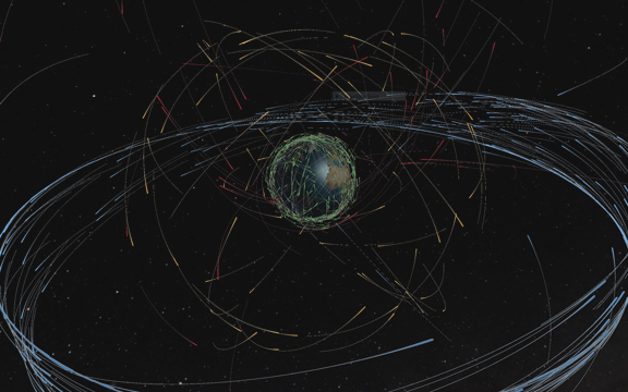
These basic design principles are not specific to VR, and characterize the 2D version of this visualization. For some orbital classes, it’s enough. For example, the density and shape of the blue Clarke Belt are both somewhat easy to make out in this shot. That said, more chaotic subsets like the gold MEO region are much harder to judge.
Exploiting Depth
Depth is VR’s primary trump card as a visualization tool. Maximizing depth cues is therefore a critical design consideration. Consider this crude approximation of motion parallax:
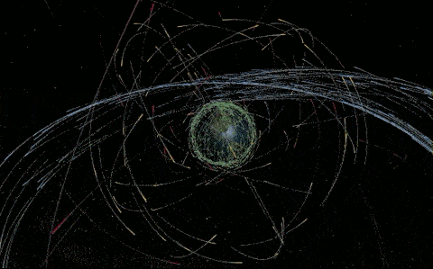
This makes the shape of the MEO orbital region far more clear than it is in the 2D screenshot above.
Most depth cues get less effective for objects that are farther away from a viewer. This means absolute scale is particularly important for VR-focused scenes. Working with real-world measurements matters, and they need to be handled consistently. Scale refinement is key to effective depth perception.
We settled on a basic rule of thumb: to maximize precision, keep important data within 10 meters of the viewer. Our version of Earth is 1 meter in diameter, which keeps most satellites inside this sweet spot. The overall modeled space for the visualization is about as big as a large office.
Scale is a trade-off, though. For example:
- Small scenes give the viewer more relative control over the position of their viewpoint with head movement. This means it can be impossible to avoid cases where the camera gets too close to rendered data. The viewer can clip their head through objects. This is jarring, and can lead to uncomfortable eye convergence because objects are too near to the viewer’s face.
- Ideal scale may be a function of current viewpoint. For example, in 6000 Moons, you can attach to a satellite’s viewpoint. For satellites far from earth, the default scale of the visualization is relatively comfortable. For near-earth satellites, the close proximity to the Earth’s surface becomes very uncomfortable. Detecting these cases and appropriately adjusting scale would significantly improve the effectiveness of the visualization.4
Using Metaphor
VR is often treated as a reality simulator. “Presence” is a commonly-discussed concept.5 As a scenario, visualization benefits from immersion, but not necessarily from suspension of disbelief.
This can be an intentional tool in the design of VR visualizations. Nothing in the 6000 Moons rendered scene is “realistic.” Our Earth isn’t only tiny: it’s inaccurately lit, unrealistically reflective, cloud- and atmosphere-free, and more.6 Unlike our representation, real satellites aren’t colored, extruded, and deformed cylindrical solids. They aren’t kilometers in diameter.
These choices are deliberate.7 For one, they complement the choice to reduce scale. Stylized rendering helps avoid the over-invoked Uncanny Valley. We’re going for something a little deeper than this, though: to invoke the metaphor that this truly is a materialized scale model, and to signal this in our visual design. This is not a trip to space; it’s a trip to a (weirdly immersive) science fair.
An aside: this isn’t unique to visualization. As VR applications mature, I expect many productive scenarios to further embrace abstraction, and focus less on rigid adherence to real-word analog.8
Overall, 6000 Moons exceeded our expectations as a uniquely effective visualization format. VR (and by extension AR) is a serious and compelling medium for building productive and beautiful visualizations. The increasing availability and affordability of VR displays, driven by consumer adoption, is likely to make it increasingly accessible and common. That’s great news.
-
There are others. Listed here are those covered by a reasonable cross-section of modern VR displays. I’m not a cognitive psychologist, but I also believe these to be the most critical. Accommodation arguably belongs on this list, but has a very limited range of effectiveness.↩
-
A more detailed run-down of display capability is beautifully covered here.↩
-
And a number of other display technologies. I’ll use VR as shorthand for this whole class of displays, particularly because they’re now becomming the most accessible.↩
-
To be clear, 6000 Moons doesn’t do anything smart here. This is something we need to fix.↩
-
Despite the quotes, we approve of Michael Abrash’s technically-focused discussion repeated in the link. Presence as a sensory phenomenon is critical in non-entertainment VR applications. In the Hollywood sense of world-building, it is not VR’s sole purpose or value.↩
-
This isn’t to say our particular choices about what to abstract are correct. We’ll continue to play with this, both in this experience and elsewhere.↩
-
This is not effective data presentation, and I think history will show that metaphor for its own sake will not be prevalent in productive 3D interfaces.↩